Dawn theme posts
Products Page
Styling the Product Image and Information
09 Jan, 2021
Almost all the users go through a product page before making an order, it can be the first impression of the product so it is a critical step in the customer purchasing decision cycle.
It is also important to remember that the user will probably be looking to several products before making a decision.
To reduce the friction in the user experience we need to make the product information more visible and accessible.
In this example I will add more images to the product and make these images and product information fit the screen size, to reduce the time the user will take to perceive the product information.
The Challenge
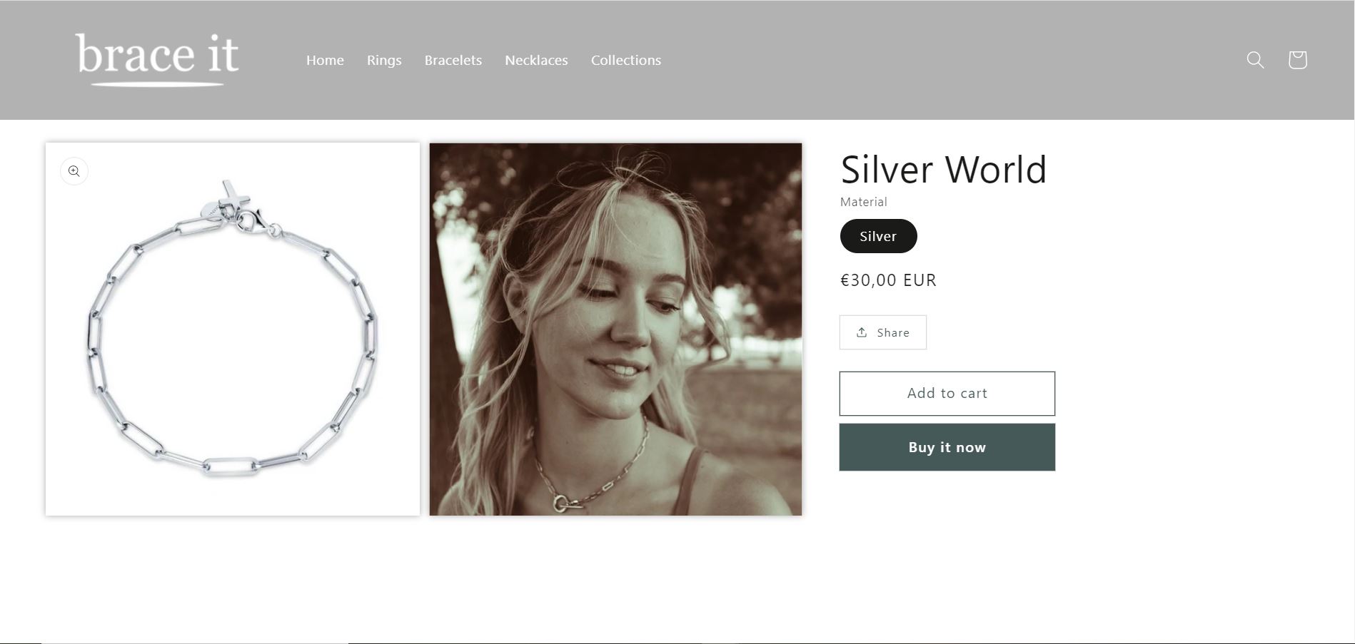
So we will reduce the size of the images, add other images with details and scale of the product.
Adittionally we will reduce the size of the text, adding some additional discription about the product.
Let's break down this job:
- Reduce the size of be visible in the screen hight
- Place additional images in a mosaic
- Allow the detailed information of the product to be displayed near the product
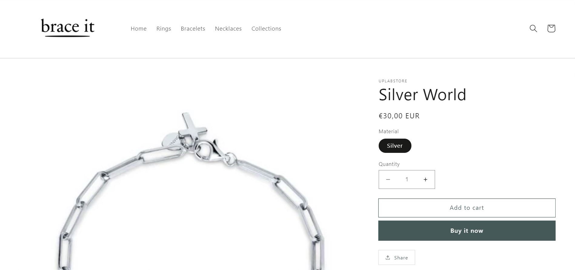
Original design
Existing CSS code
To find the file go to: assets>section-main-product.css
/* product titLe */
.product__title {
  word-break: break-word;
  margin-bottom: 1.5rem;
}

/* Product info */
.product__info-container > * + * {
  margin: 1.5rem 0;
}

/* product image size */
@media screen and (min-width: 990px) {
  .product:not(.product--no-media) .product__media-wrapper {
    max-width: 64%;
    width: calc(64% - 1rem / 2);
  }

  .product:not(.product--no-media) .product__info-wrapper {
  padding-left: 4rem;
  max-width: 36%;
  width: calc(36% - 1rem / 2);
  }
}

/* images position*/
@media screen and (min-width: 750px) {
  .product__media-item:first-child {
    width: 100%;
  }
}
The Solution
To find the file go to: assets>section-main-product.css
/* remove margin of the product title*/
.product__title {
    word-break: break-word;
    margin-bottom: 0rem;
}

/* idem */
.product__info-container>*+* {
    margin: 0rem 0;
}

/* change the size of the product image */
@media screen and (min-width: 990px) {
  .product:not(.product--no-media) .product__media-wrapper {
    float: left;
    max-width: 60%;
    width: calc(60% - 1rem / 2);
    /* box-shadow: 10px 10px 4px #ababab; */
    filter: drop-shadow(0 0 0.35rem #ababab);
  }

  /* reduce size of div where product information is */
  .product:not(.product--no-media) .product__info-wrapper {
    padding-left: 4rem;
    max-width: 20%;
    width: calc(20% - 1rem / 2);
  }
}

/* images side by side 100% to 50% and create a second child selector */
@media screen and (min-width: 750px) {
  .product__media-item:first-child {
    width: 50%;
  }

  .product__media-item:nth-child(2) {
    width: 50%;
  }
}