Dawn theme posts
Homepage
Make the collections section more appealing
22 Dez, 2021
The collections section can be add to the homepage or other page. It is a great way for the visitor to perceive and explore the different collections and range of your products.
You may want to adapt the design of this sections to be more connected with the look&feel of your brand.
In this example I will make the design more clean by filling the width of the screen with the images and removing margins between them. Aditionally I will move the collections names to the middle of the images and remove the grey boxes.
These changes whill give more presence to the collections images adding a more interative experience with the names of the categories.
The Challenge
Let's break down this job:
- Center the title of the section
- Elimate the margin between images
- Reposition the name of the category in the center of the image
- Remove the background color behind the text
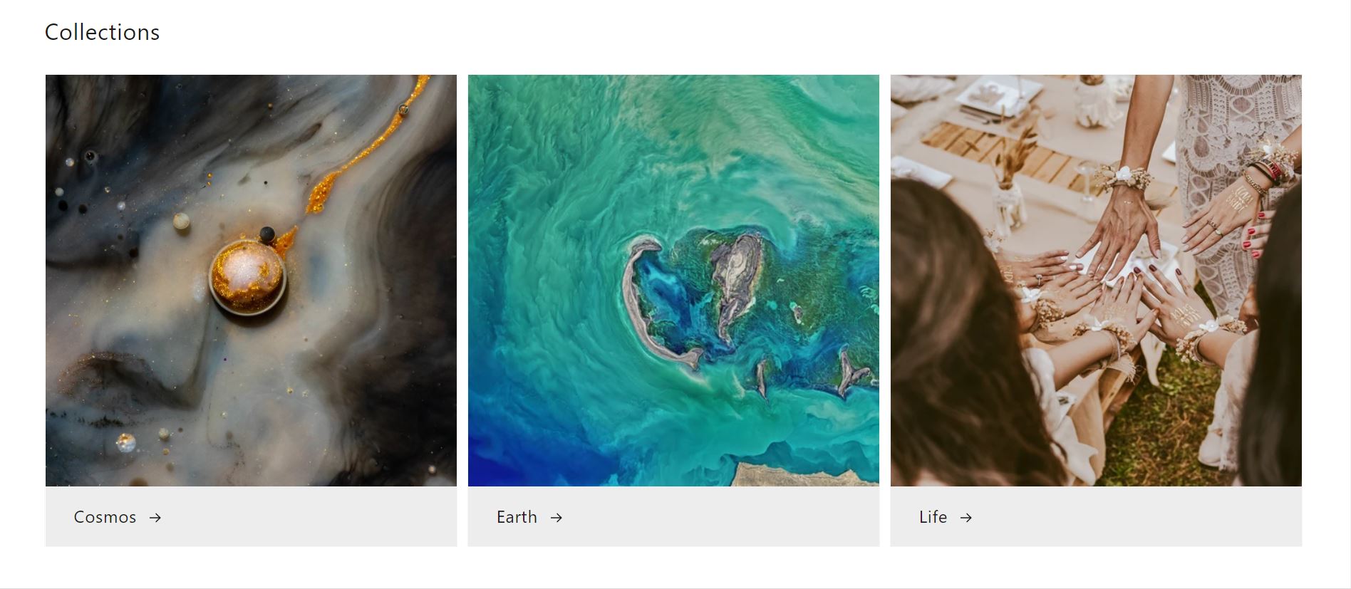
Original design
Existing CSS code
To find the file go to: assets>base.css
  @media screen and (min-width: 990px) {
    .header {
      padding-top: 2rem;
      padding-bottom: 2rem;
    }

    /* write another post about nav bar! padding top down of nav bar */
    @media screen and (min-width: 990px) {
      .header {
        padding-top: 2rem;
        padding-bottom: 2rem;
      }


      .title-wrapper-with-link {
        justify-content: space-between;
      }
    }
Existing CSS code
To find the file go to: assets>component-card.css
    @media screen and (min-width: 750px) {
    .card--media .card__text-spacing {
      padding-left: 3rem;
      padding-right: 3rem;
    }
  }

    .card .icon-wrap {
    margin-left: 0.8rem;
    white-space: nowrap;
    transition: transform var(--duration-short) ease;
    overflow: hidden;
  }

  .card--light-border {
    border: 0.1rem solid rgba(var(--color-foreground), 0.04);
  }

  .card--light-border:hover {
    border: 0.1rem solid rgba(var(--color-foreground), 0.3);
    box
The Solution
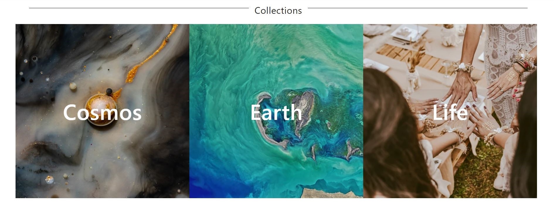
To find the file go to: assets>base.css
  /* remove padding between images */
  .grid--3-col-tablet .grid__item {
    width: calc(33.33% - 1rem* 2 / 3);
    padding: 0px;
  }

  /* remove padding top down of nav bar */
  @media screen and (min-width: 990px) {
    .header {
      padding-top: 0px;
      padding-bottom: 0px;
    }

    /* center section title */
    .title-wrapper-with-link {
      justify-content: center;
                }
To find the file go to: assets>component-card.css
  /* changed position of collections titles under images to over images */
  @media screen and (min-width: 750px) {
    .card--media .card__text-spacing {
      position: absolute;
      top: 50%;
      left: 50%;
      transform: translate(-50%, -50%);
    }
  }

  /* remove arrow */
  .card .icon-wrap {
    display: none;
  }

  /* changed font of collections titles*/
  .card__text h3 {
    color: white;
    font-weight: 600;
    font-size: 4em;
    width: 300px;
    text-align: center;
  }

  /* white frame */
  .card--light-border {
    border: 0rem solid rgba(var(--color-foreground), 0.04);
  }